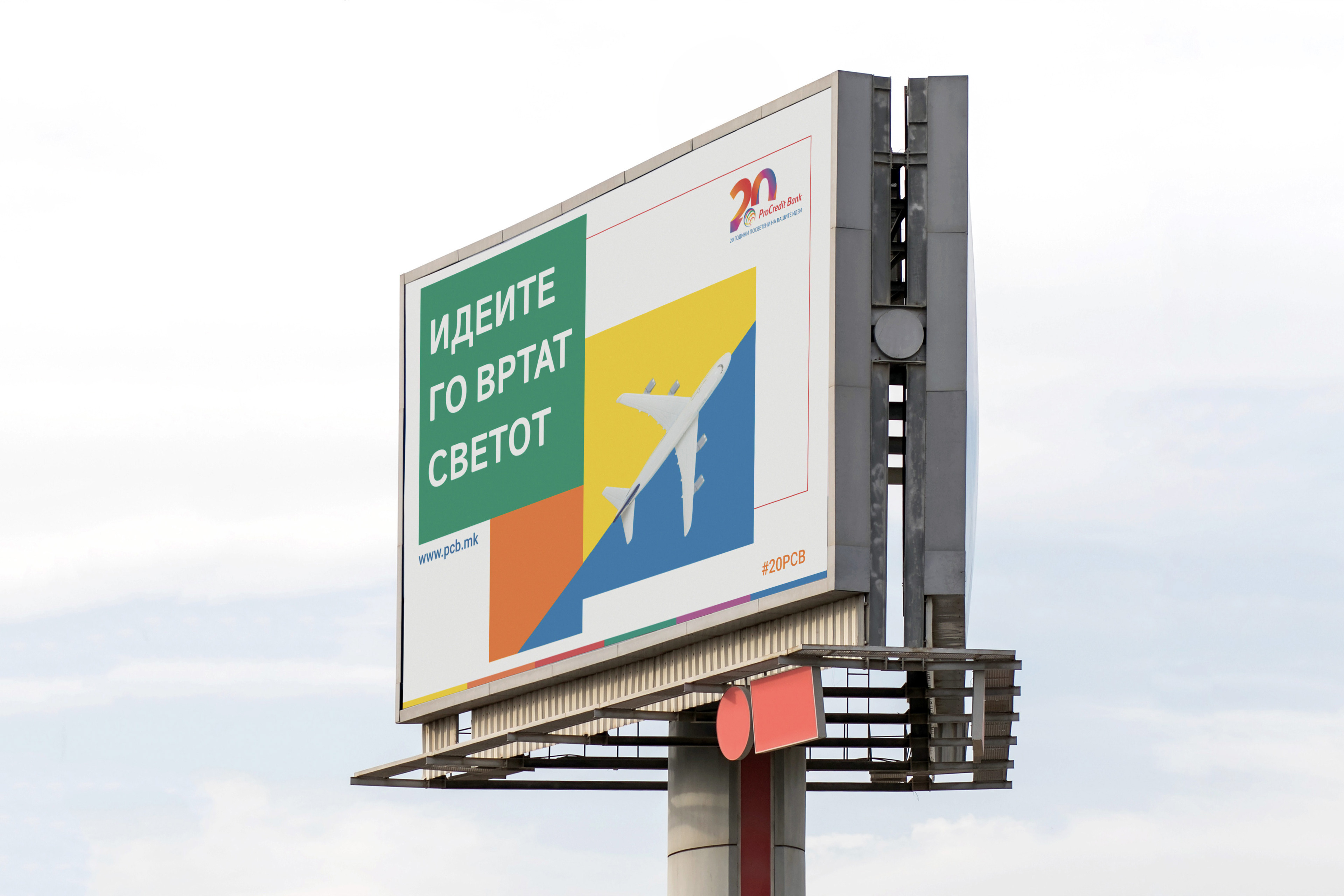
ProCredit Bank
Marking 20 years of operation, the campaign was conceived as a year-long initiative telling the story of ProCredit Bank’s evolution as the first fully digitalized bank, eliminating the need for any physical branch visits for services. I contributed to the creative process through the development of part of the logo and active participation in the pitching phase, helping define the campaign’s concept and visual direction.

The logo features the number 20, constructed using gradients of warm tones from the brand’s color palette, aiming to convey a modern, vibrant, and distinctive visual identity.

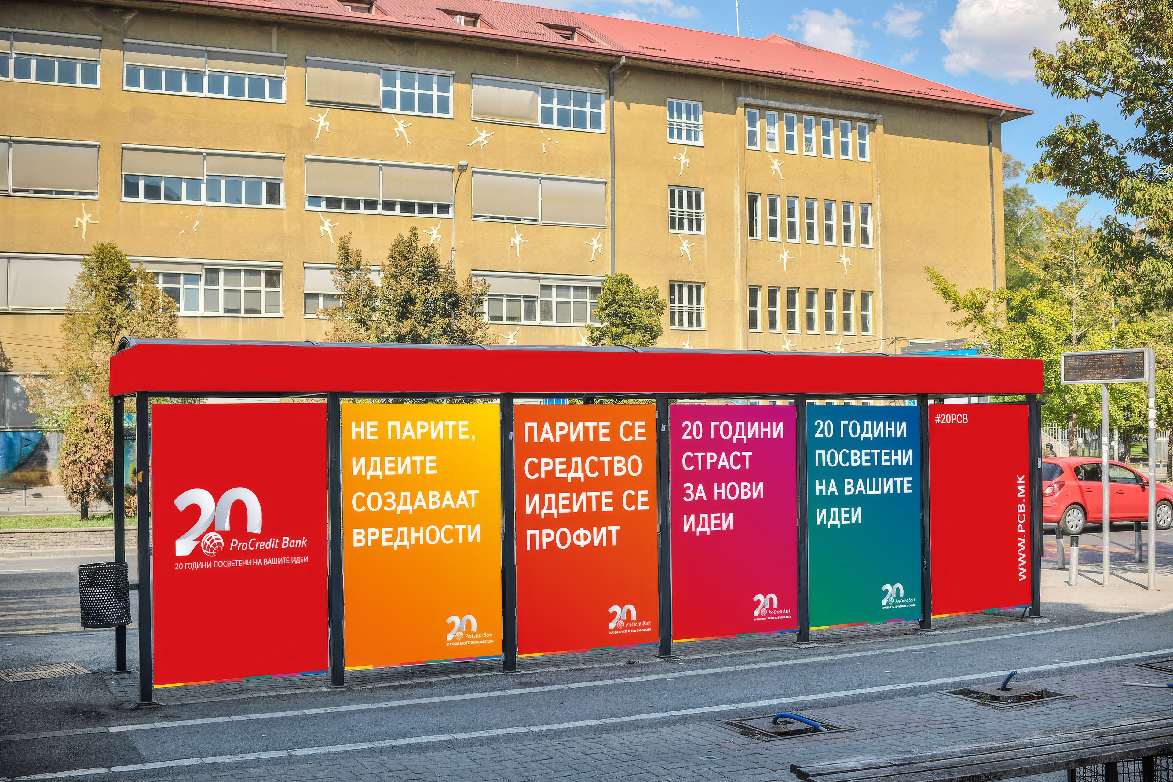


My idea was a clean and simple campaign that clearly communicates the message, but also uses clickbait visuals such as ‘A ProCredit Bank spotted in the middle of Lake Ohrid.